One Room Challenge - Week Two | The Layout
In our line of work and specifically in our niche of small spaces, layouts are King. An optimized layout can completely transform a space even with the existing furniture, so before I specify a single piece of new furniture, I finalize the layout. During this process, I consider every single piece of furniture and where it will live in the space. This eliminates the guesswork and fumbling when things arrive. For this specific space, we’re working with a room that’s 8’11” x 10’7” and a 7.5’ ceiling height. It’s TINY. This is where our tricks of the trade come into play — we’re finding ways to draw the eye up to emphasize what little height there is in the space, we’re leaving as much open space as possible to make the room feel larger than it is, and we’re selecting multipurpose furniture. There’s a few other tricks involved, but I can’t tell you all my secrets (lol).
Process of Elimination
Let’s talk about the layout and furniture choices. We’ve gone through a few iterations of this space before getting the layout down on paper.
Option 1: Mini Bunk Bed
The first contender for the sleeping area was a mini bunk bed. Bunk beds are usually a great choice for shared rooms and mini bunk beds work great for toddlers; however, my 2 year old is a daredevil and I know for sure he’d want to climb to the top bunk with his brother and try some new jumps. Additionally, the ceilings are only 7.5’, so even with a 46” high bunk, we’d only have a little over 3 feet of clearance before we are within reaching distance of the ceiling fan. The ceiling fan gets used quite a bit in this room in the summer time, and I can’t tell you how many times I’ve hit the ceiling fan with my hands reaching up to stretch or put my shirt on. It’s a no for this one.
Option 2: Corner Beds
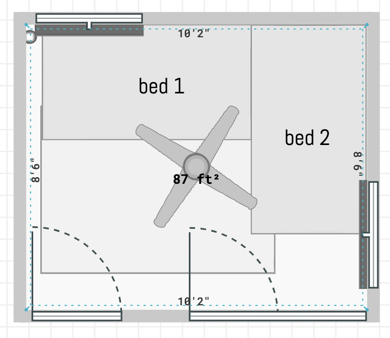
The second contender was a L shaped configuration with 2 twin beds. Much safer! I imagined the two having a conversations at bedtime about whatever 4 and 2 year olds talk about and having some quality brother time head to head. I was sure this option would work! Then, I measured the space and realized this configuration would consume most of the room. While I do love and support bedrooms that are mostly bed, this layout didn’t allow any space for storage and it felt way too much like a furniture store to me. That’s never the vibe we’re going for. This why we always measure first! It’s a no for this one, as well.
Option 3: Trundle Bed
We’re never discouraged when we’re challenged by a space. In fact, its exciting to figure out a layout that’s exactly right. It’s very much like Tetris where you manipulate a piece until you find the perfect fit. For this space, that perfect fit came in the form of a trundle bed. It takes up the space of one bed like the bunk bed does and gives the intimate feel of side by side beds like the L shaped configuration does. Mission accomplished!
Once we solved for the largest piece of furniture, we were able to slide in the other elements like storage and accessories fairly quickly. For storage, we’re going for a low cabinet that will house toys and books that they can access. We’ll keep the cabinet closed to help fend off visual clutter. And use the wall above it for an art display and a place to put a TV for movie nights. We will also be adding in ottomans for flex seating. There’s not quite space for a dedicated chair in here, but that’s why we love ottomans. They can be at the foot of the bed for bedtime stories, a resting place for pajamas or the clothes of the day, and fun seating perfect for small children.
That’s all I’ll share for now. Follow along on Instagram stories to see the progress and check out the other fantastic ORC participants here. If you missed week one, you’ll want to check it out at the link below.


